

Karibu

100 font styles
variable font

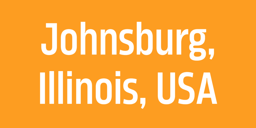
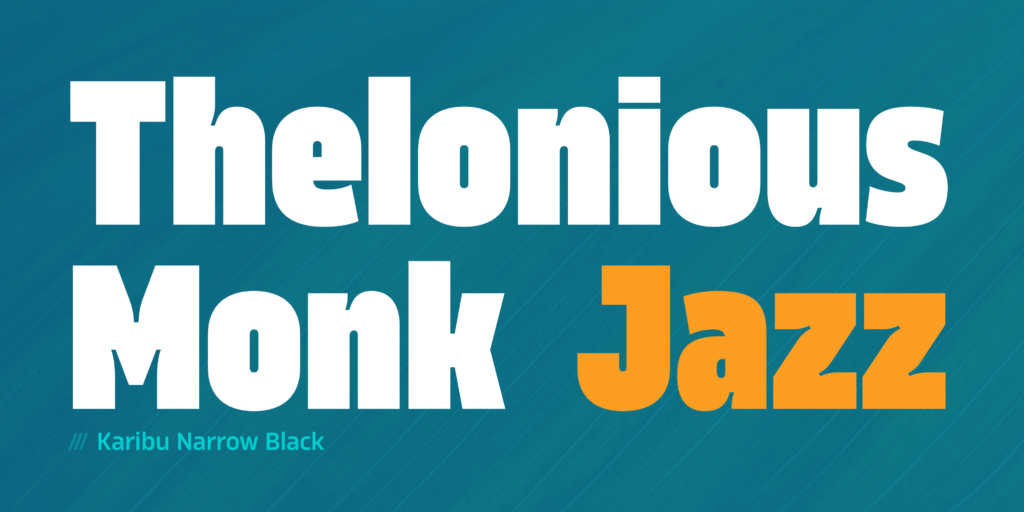
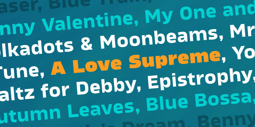
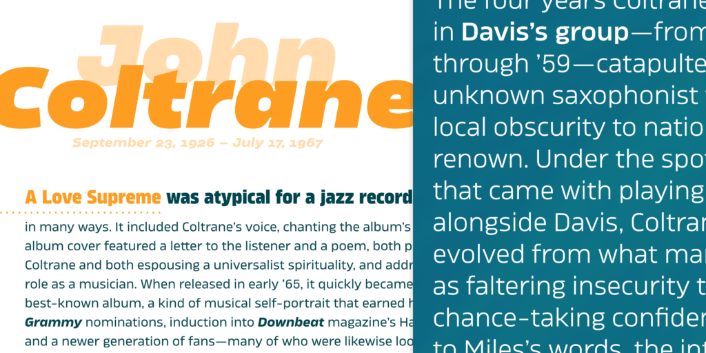
Karibu is an original, highly versatile block sans family characterized by a strong, distinct personality. Designed to meet the demands of contemporary projects, it functions exceptionally well as both a striking display typeface and a highly legible option for extensive paragraph text.

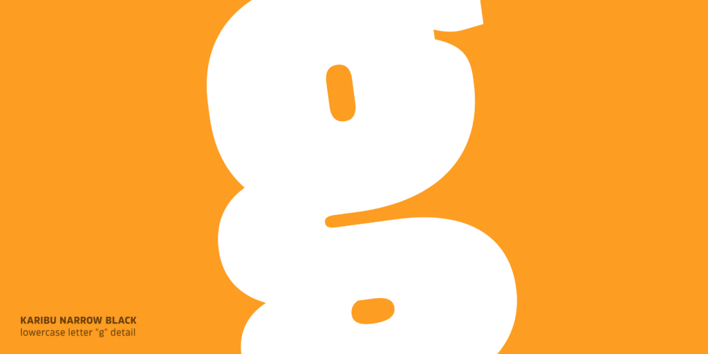
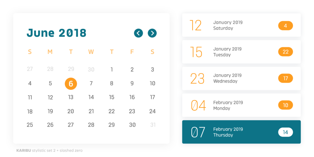
The typeface is engineered with distinct, pronounced ink traps and a large x-height. These features not only improve legibility at small sizes but also add a striking, confident character to large display typography. In the narrower widths, flattened letter shapes are introduced to create a smooth vertical rhythm and a sense of elegance. For projects requiring a more technical and minimalist approach, a dedicated alternate stylistic set is available.

It performs flawlessly across editorial design, logotypes, and branding, as well as in digital environments such as web design, user interfaces (UI), and mobile applications.

Key Features

  • 100 styles (10 weights, 5 widths + italics)
  • 5 versatile widths (Narrow, Condensed, Normal, Expanded, Wide)
  • Pronounced ink traps and large x-height for enhanced legibility
  • Flattened letterforms in narrow widths for elegant vertical rhythm
  • Extended Latin language support

Font Testers

Loading...
Headline typeface
Loading...
flat-sided
Loading...
free jazz
Loading...
Going down the river...
Loading...
Schöne Grüße
Loading...
Widespread
Loading...
Competition #24, good -> metrics (p)
Loading...
broad strokes
Good typography is the invisible thread that connects your message to your audience. It is not just about choosing a beautiful typeface, but about creating harmony, clear hierarchy, and flawless readability. When text is set thoughtfully, it guides the eye effortlessly from one line to the next, making the reading experience intuitive and natural. Whether displayed on a glowing digital screen or a printed page, the right typographic choices elevate the content. Furthermore, excellent typography establishes the tone of voice before a single word is comprehended. It builds trust, reinforces brand identity, and reduces cognitive load, allowing the reader to fully absorb the information. In a world saturated with content, the subtle art of arranging type is often the differentiating factor between a message that is ignored and one that resonates deeply with its intended audience. It transforms complex information into accessible knowledge, inviting the reader to truly engage rather than merely skim. Ultimately, a masterful typographic layout is simply an act of empathy towards the user. It proves that the way a story is visually presented can be just as impactful as the words themselves. In the end, great typography doesn't just deliver a message; it breathes life into it, ensuring it echoes in the reader's mind long after the page is turned.
Type design is a meticulous craft where precise engineering meets art. Every curve, counter, and serif is carefully sculpted to balance unique personality with ultimate functionality. A well-designed font must perform flawlessly across various sizes and mediums, maintaining its distinct character while ensuring a perfect reading rhythm. The process requires an intimate understanding of optical illusions; for example, horizontal strokes must be thinner than vertical ones to appear equal in weight, and round characters must overshoot the baseline to prevent them from looking smaller than flat ones. Type designers spend countless hours adjusting kerning pairs and refining spacing to ensure that every letter combination locks together harmoniously. This relentless attention to micro-typography guarantees that the font behaves predictably, empowering graphic designers with a powerful tool to create stunning visual narratives. Ultimately, the greatest triumph of a type designer is creating a work of art so seamlessly functional that its structural brilliance goes completely unnoticed by the average reader.
Book typesetting is the ultimate test of typographic endurance. Unlike a poster or a digital ad, a book requires sustained attention over hundreds of pages, making the reader's comfort the absolute highest priority. The typesetter must carefully calculate the ideal line length, line height, and margins to prevent eye fatigue. Every paragraph must be justified with precision to avoid unsightly rivers of white space flowing through the text block. Orphans and widows—those lonely lines of text left at the top or bottom of a page—must be ruthlessly eliminated to maintain a solid, uninterrupted rectangle of text. When book typesetting is executed masterfully, the typography essentially becomes invisible, serving only as a flawless, transparent vessel for the author's narrative.

Character Set

Loading character set...
Aa

Technical Specifications

  • Designer: Roch Modrzejewski
  • Launch Date: October 12, 2018
  • Number of Styles: 100
  • Glyph Count: Loading...
  • Variable Font: Yes
  • Variable Axes: Loading...
  • Supported Scripts: Loading...
  • OpenType Features: Loading...
  • Version: Loading...
  • File Formats: WOFF2, TTF, OTF

Supported Languages

Font Pairing

Finding the perfect typographic match is essential for creating a cohesive and engaging design. We have carefully selected these typefaces to perfectly complement the unique character of this font, ensuring harmonious contrast, flawless readability, and a polished visual hierarchy for your next project.

Explore all fonts

Available Licenses

more on licenses →

Choose the perfect license tailored to the needs of your project and team.

Trial

Free evaluation license for internal mock-ups, client pitches, and student projects. Strictly no commercial use or public deployment.

Desktop

Install on local workstations for print, packaging, and static digital graphics. Tiered by the total number of users (workstations).

Logo & Trademark

Create and legally register a primary brand logo or trademark. Allows for vector outline modification for a single brand identity.

Web

Self-host and embed fonts into your website using @font-face. Scaled by total monthly Pageviews.

Application

Securely embed fonts into your mobile or desktop application's UI. Tiered by total app installations, downloads, or registered users.

Video Game

Securely embed fonts into a game engine (Unity, Unreal, etc.) for a specific game title. Scaled by total copies sold or active users.

Video / Broadcast

Professional license for film, TV, and streaming titles/credits. Scaled by the specific number of audiovisual projects or series.

Digital Ads

Securely embed fonts into HTML5 banners and digital ad units. Tiered by the total number of campaign Impressions.

ePub

Securely embed fonts into e-books, digital magazines, and interactive PDFs. Tiered by the number of Titles or Issues.

Server

Install fonts on remote servers to power SaaS applications, web-to-print tools, and automated document generation. Tiered by the number of server instances.

OEM / Hardware

Securely embed fonts into hardware firmware, consumer electronics, and touchscreens. Tiered by the total number of manufactured units.

Enterprise

An unlimited, all-inclusive license for single organizations. Covers all media, unlimited employees, logo registration, and sharing with partner agencies.